Brand Identity and
Signage System
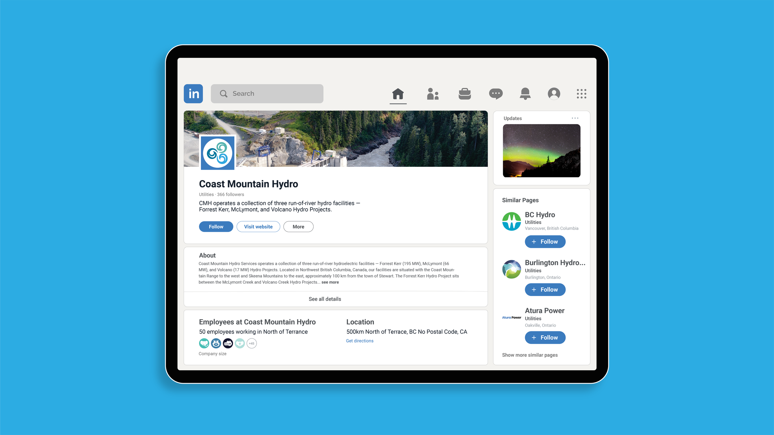
Coast Mountain Hydro
Roodenburg Design Consultants were engaged in developing a distinct brand identity for Coast Mountain Hydro in guiding ongoing marketing and communications initiatives.
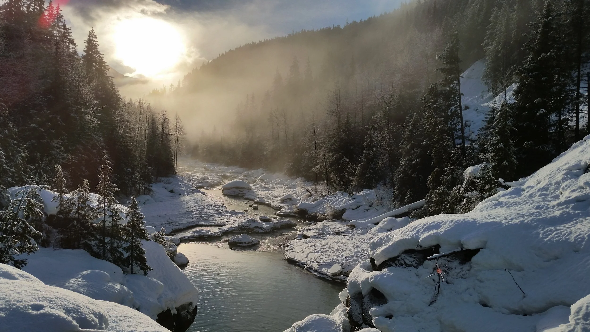
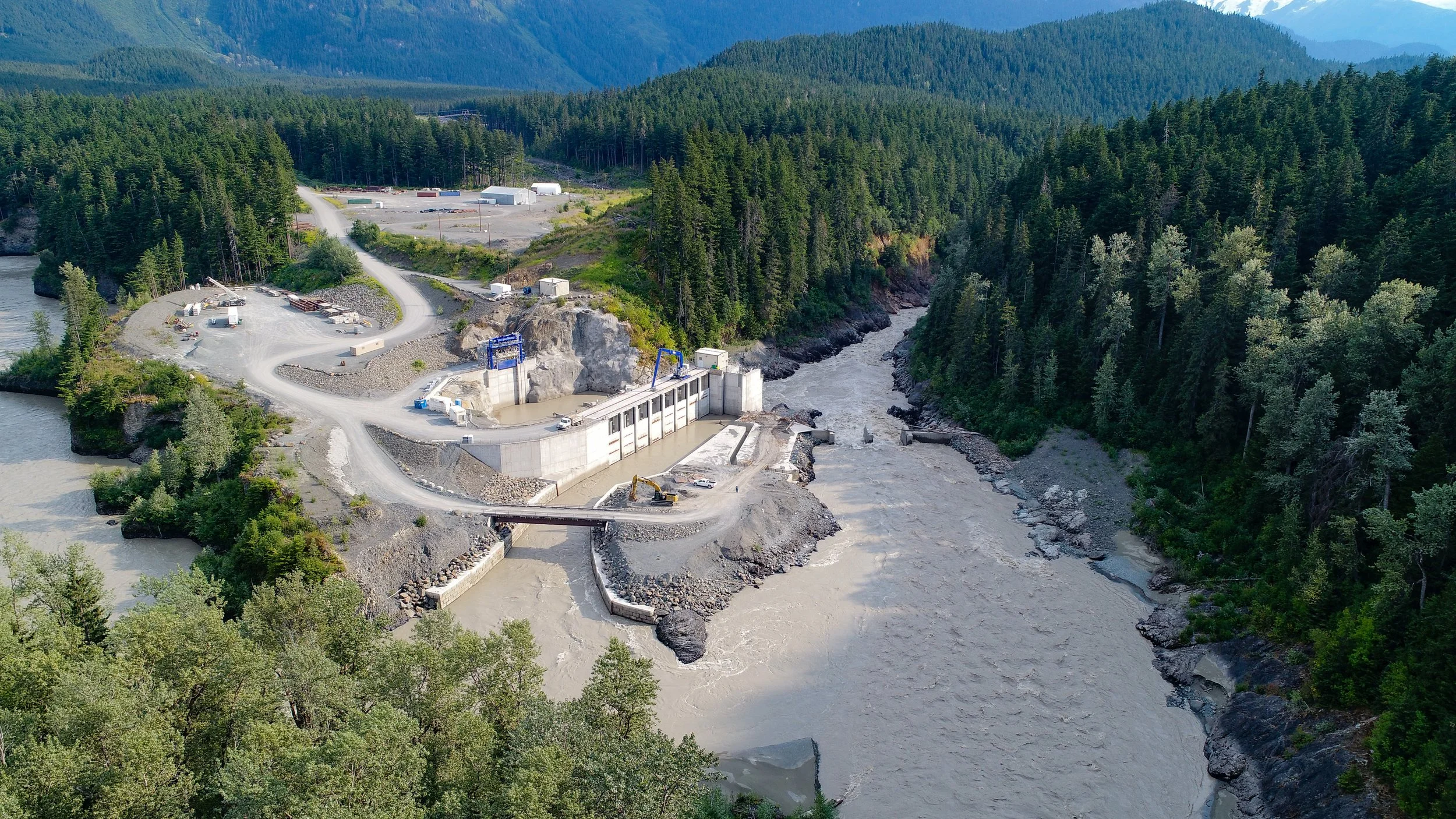
Coast Mountain Hydro (CMH) is an award-winning run-of-the-river hydroelectric project – comprising the Forrest Kerr, McLymont, and Volcano Hydroelectric Facilities. Located in Northwestern BC, with the Coast Mountain Range to the west and Skeena Mountains to the east, their facilities are approximately 100 km from the town of Stewart and within the Golden Triangle in Tahltan Territory. CMH generates 300 megawatts, enough to power 225,000 homes, providing clean power to local Tahltan communities, businesses, and industry.
What happened/What we did
Coast Mountain Hydro was suffering brand confusion due to inconsistent identity applications and naming conventions, to name a few issues.
Signage referred variously to the project as Alta Gas, Northwest Projects, and the Northwest Hydroelectric facilities. Some publications referenced Coast Mountain Hydro Limited Partnership, while others as Coast Mountain Hydro Northwest Projects. Many individuals, both inside and outside Tahltan Territory, referred to the project as Alta Gas. The website named the entity as Coast Mountain Hydro Services, when in fact, this was not the name of the actual project. Beyond identifying this problem and creating a consistent name, the graphic applications and identity program needed to be resolved.


An engaging approach
Consultation with stakeholders was facilitated by RDC in the form of a brand workshop to acquire the basis for our research and strategy. A vital outcome of this facilitation process is team-building, where people will feel they have been heard, that their thoughts and ideas have been given due consideration and respect and that the final result reflects stakeholder input.
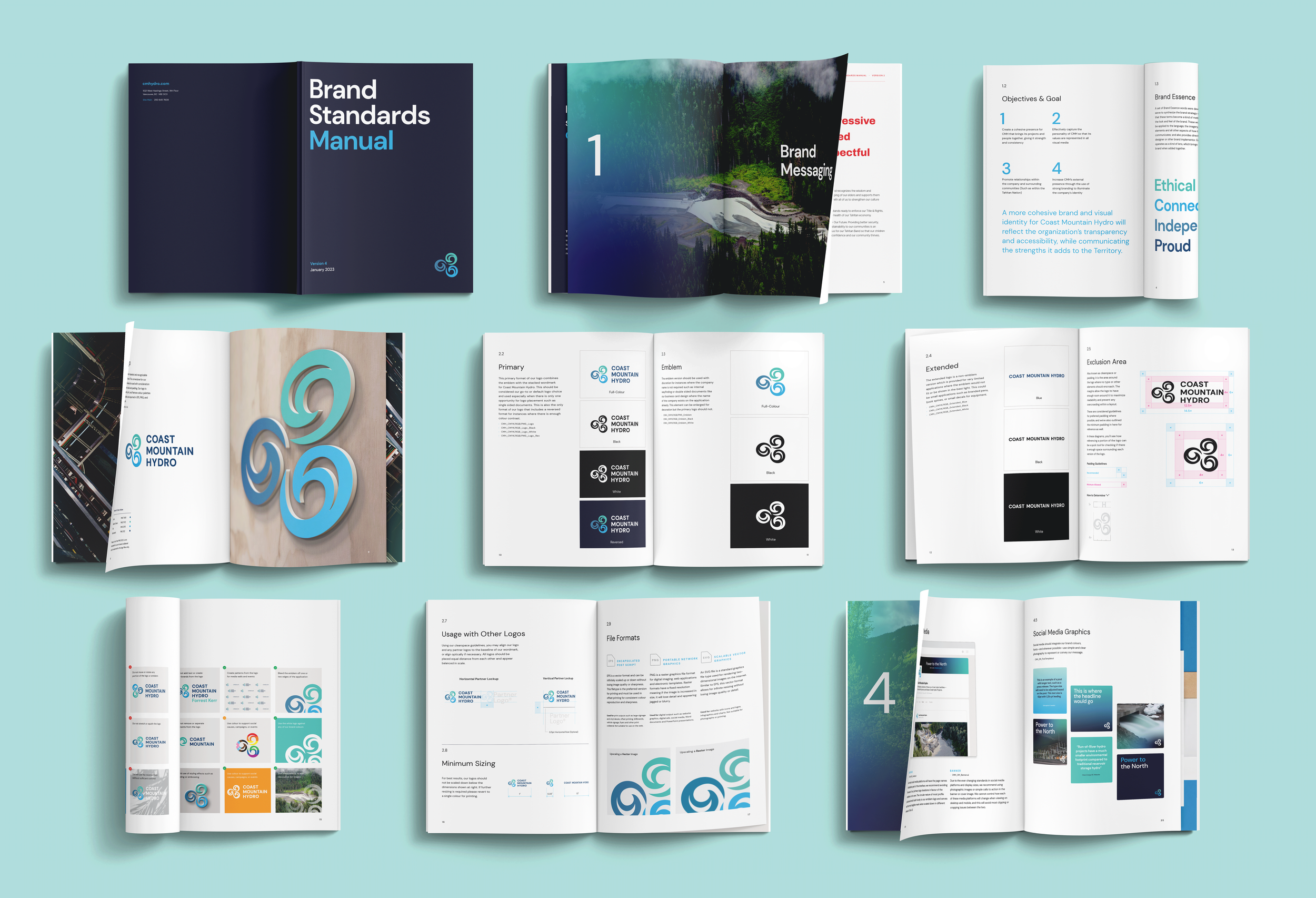
The brand goal was to develop a more cohesive brand and visual identity for Coast Mountain Hydro that reflects the organization's transparency and accessibility while communicating the benefits it brings to communities within the Tahltan Nation.

Branding and design intent
The intent was to build an identity system that can adapt to changes in campaign communications while maintaining a cohesive look as it changes over time. The idea is to enable enduring familiarity with the brand while providing an opportunity to explore new ideas and applications in future and to reflect the evolving nature of the industry.
The new brand honours and respects indigenous considerations and the rich traditions of the region’s history and identity. The creative approach reflects the brand essence and combines the three facilities into a unified, fresh, and updated graphic program for the CMH parent brand.

Outcome
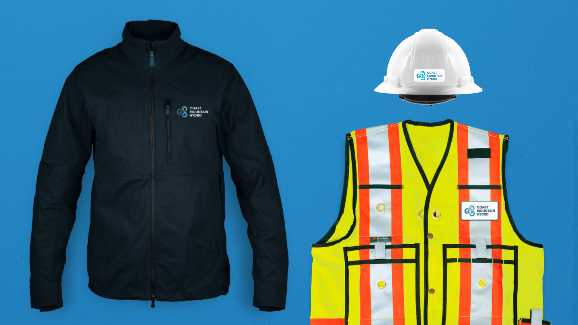
The new identity system makes for efficiencies, speed of delivery and flexibility across all media formats. The flexible suite of business papers and documents utilizes economical and environmentally sensitive approaches to design, such as using light ink coverage and effective digital layouts, to reinforce the CMH’s commitment to sustainability.
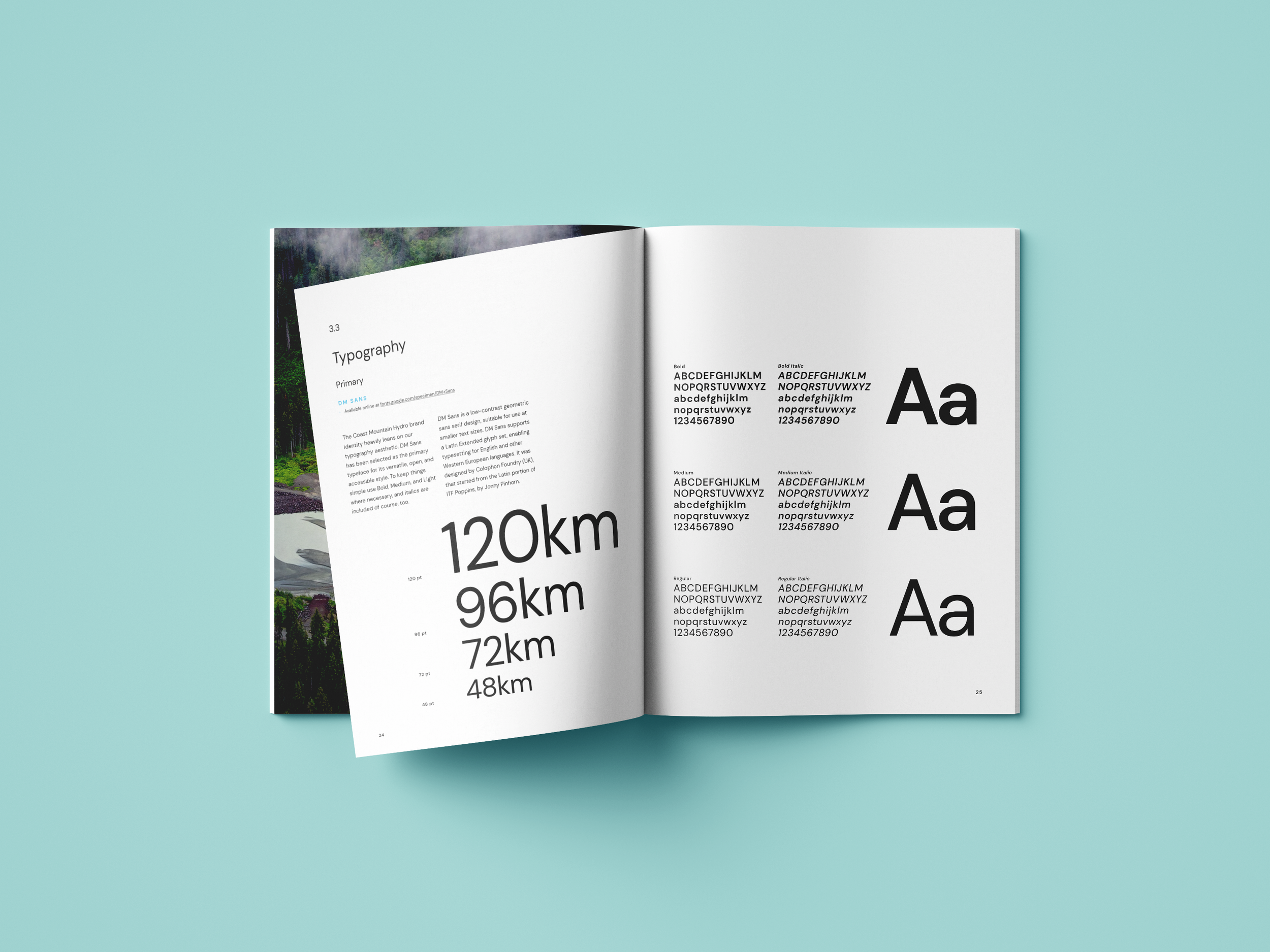
The identity system clearly defines grids and typographic styles to keep correspondence light and legible. Typeface choices reinforce a modern, light approach. Electronic templates consider inkjet and laser printing as well as on-screen viewing.
In addition to the sky/ice blue colours, an extended palette helps to ground the identity and provides creative and progressive attributes.
An inspiring brand book was developed that includes a set of guidelines to govern the use of the brand identity and convey the brand’s spirit. The booklet will guide anyone working with the brand so they are both inspired and know how to implement it.